Some digging into embedding comparable images
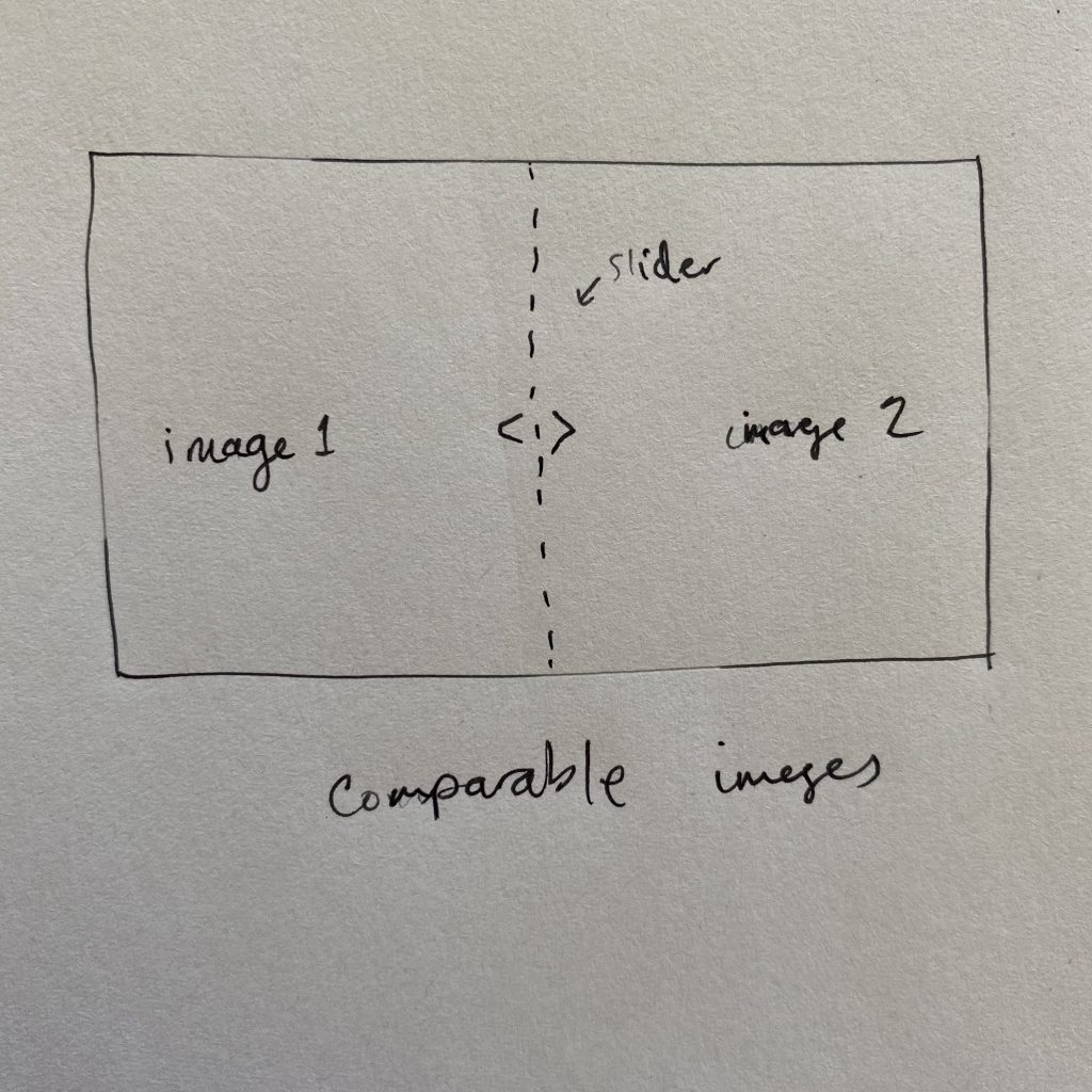
I recently had an idea to compare two images side by side and ideally having a slider present to be able to see one more than the other. I wanted to get to a MVP of this but after spending a couple of hours, I decided to just jot down my notes about it so far and move on. Another reason is that I’m trying to make this blog into a thought stream instead of just polished posts of some kind.

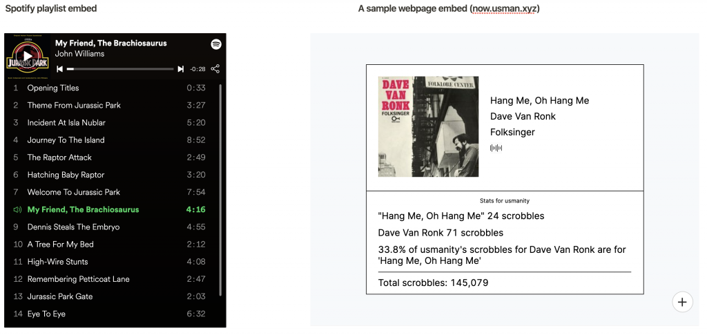
Examples of embedded objects
This Spotify embedded object is a great example of both functionality and style, it looks and feels like using the Spotify app and it’s easily embeddable.
Some places like WordPress only allow embedding from certain URLs and others like Notion allow embedding anything that doesn’t block embedding, see a screenshot below:

I tried a couple of different techniques to try to get two images to be comparable, you can see them in this codepen: https://codepen.io/usmanity/pen/dyYaVpY
Unfortunately, I couldn’t get a working version of it because my approach has been mostly CSS-first and I didn’t want to spend too much time writing JS to handle different parts of the dragging. One attempt I had was to watch drag and other events related to it, more here: https://developer.mozilla.org/en-US/docs/Web/HTML/Global_attributes/draggable
This approach didn’t work because draggable is great for moving around elements but there was still no good way to get the difference in dragging unless I spent a fair amount of time calculating differences between the starting point and where the dragged slider was.
I also tried a border size and range input approach, basically use the value from the range slider and set that as the border size, but this didn’t work because the border would increase while decreasing the size of the image itself.
My next attempt will be to use a background size approach but right now I feel pretty burnt out by the past few approaches so I’ll wait on trying that.

