Apple Card First Impressions
I decided to try the Apple Card and so I signed up for one about 10 days ago. Below are some of my thoughts on it but please don’t think this is a full review of the card which I’m sure you can find in many other places, I will only focus on a few things I care about.
Getting approved
The Apple Card lines up very well with the mid-to-high credit score base, this is anything from 680 to 750 and higher. This means that Apple or in the case of the approval, Goldman Sachs, doesn’t really do anything differently than any other bank so if you have a card like the Chase Freedom, any of the non-premium Amex cards, or cards like Uber, Amazon, and Discover It, you shouldn’t have any trouble getting approved for this card. In my opinion, the mid-to-high credit score having base is the base that usually has iPhones so Apple is doing a good pick of their customer base.
Card features
So before we get to the app features, I wanted to talk about the Apple Card as a regular credit card and its features. Cashback is pretty easy to understand, albeit a bit backwards:
- 3% only at Apple (store, iTunes, app store, and Apple.com website)
- 2% on everything paid for using Apple Pay
- 1% with on everything paid for with the physical Apple Card
And the above cashback is paid everyday under the term “Daily Cash” that’s deposited into your Apple Cash Card (the other one in your Wallet app). The payout happens around “end of business” day (6-7pm) for me, which might not be the case for everyone but since I’m in the same timezone as Cupertino, it might work out nicely for me.
Other than that, a couple of features I’d like to highlight:
- No foreign transaction fees
- No annual fees
- No late payment fees (although Goldman Sachs will be happy to jack up your interest rate)
App powered Card
The Wallet app has come a long way since Passbook where it contained loyalty cards and boarding passes, now it contains a whole payment ecosystem! Below are some screenshots of what the UI looks like when the card as some activity on it:

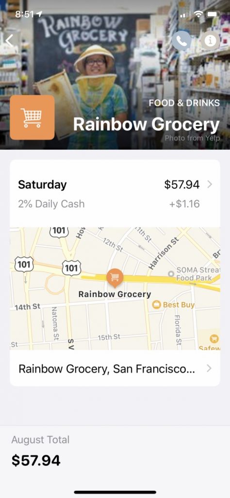
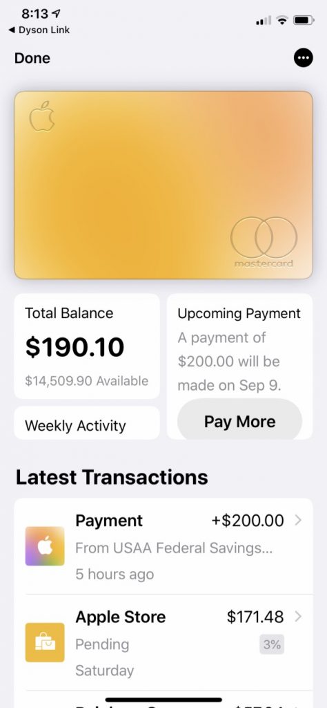
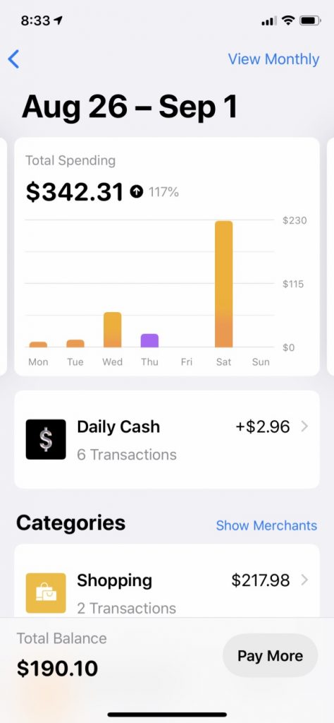
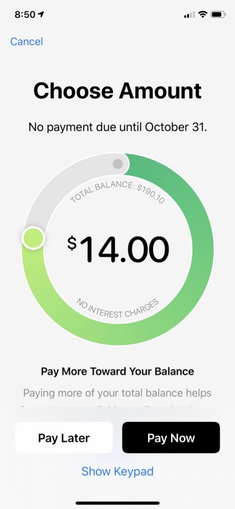
So overall, the card as a nice UI but I think there is a lot of room for improvement. A lot of the logistics of the card are hidden away in the settings page which some times you’ll want to be able to access without tapping a couple of times. The main annoyance I’ve felt is that the “Pay Later” mechanism is different depending on where you enter that flow. If it’s from the main card view, it will just ask you when you want to pay later, but from the settings view, you have the ability to choose how much and how often not just when.
One very good thing Apple has done with this card which I believe is a huge credit card experience improvement is simply to show your “current balance” containing all your spending, including “pending” transactions. Because as a customer, I don’t care if my bank has not “settled” with the other parties yet, I want to know at a glance how much money I’ve spent so far. If I spent $100 today and it’s pending for 3 days, I will still be responsible for it whether it was settled today or from 3 days from now, I spent the money today! Chase is notoriously bad at this, some transactions will be pending for up to a week so your balance will go from $0.00 to whatever you did over the past week all in one day!
Color changes
Yes, the Apple Card’s colors change in the app but…I’m not sure how they will look day to day since I’m only doing 2-3 transactions at most a day so some day the card looks blue and others it looks orange. Maybe others have had a better experience with this but for me, it looks like a nice marketing gimmick.
As you can see, this is not a full review so please go somewhere else to read that but for me I just wanted to jot down these notes. I do hope it gave you a bit more context 😁
